Wearing Home – Seven Clubs, Seven Identities
How the new PUMA Bundesliga jerseys bring clubs’ cities, regions and traditions onto the pitch
July 24, 2026
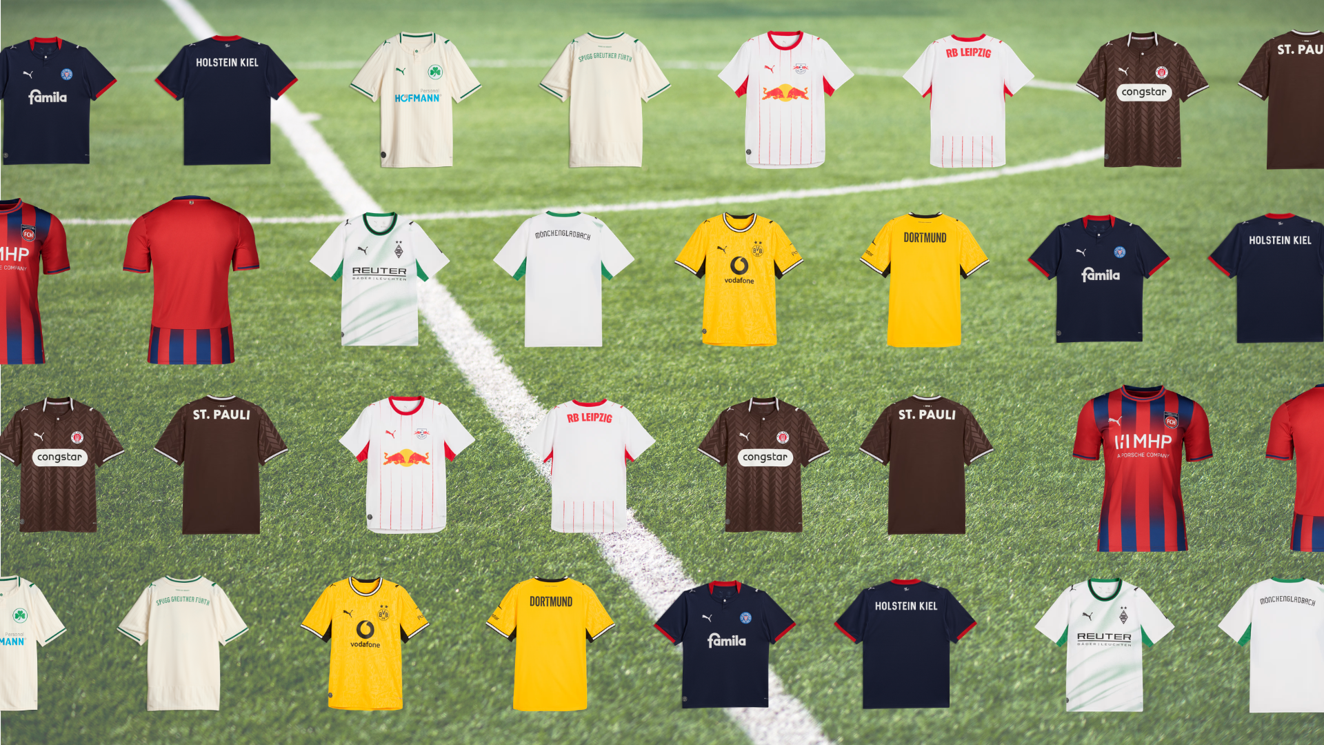
The new PUMA jerseys for the 2026/27 German football season show just how many different ways local identity can come to life. Equipping seven clubs across the Bundesliga and 2. Bundesliga, PUMA has drawn inspiration from each club’s unique character – from cities and stadiums to club crests, regional pride and decades of tradition.
From Borussia Dortmund, Borussia Mönchengladbach and RB Leipzig in the Bundesliga to FC St. Pauli, SpVgg Greuther Fürth, Holstein Kiel and 1. FC Heidenheim in the 2. Bundesliga, discover the special elements that bring each club’s identity to life in its new home jersey.
Borussia Dortmund: A City Woven Into the Jersey
Borussia Dortmund’s black-and-yellow home jersey carries a piece of the city into the new season. Its graphic pattern incorporates two Borussia Dortmund’s black-and-yellow home jersey carries a piece of the city into the new season. Its graphic pattern incorporates two well-known Dortmund landmarks: the former “Minister Stein” coal mine and the Dortmunder U, a former brewery building that today serves as one of the city’s main cultural centres.
Together, the two symbols reflect different chapters of Dortmund’s history, from its industrial roots to its cultural transformation. Woven into the club’s iconic colours, they create a direct link between BVB and the city it calls home.
Together, the two symbols reflect different chapters of Dortmund’s history, from its industrial roots to its cultural transformation. Woven into the club’s iconic colours, they create a direct link between BVB and the city it calls home.
Borussia Mönchengladbach: A Modern Take on a Classic Look
Borussia Mönchengladbach’s new home jersey builds on familiar foundations.
The white base and green accents remain unchanged, reflecting colours that have defined the club’s identity for generations. For supporters, they are more than just colours; they carry memories of countless moments in the stands and on the pitch.
The white base and green accents remain unchanged, reflecting colours that have defined the club’s identity for generations. For supporters, they are more than just colours; they carry memories of countless moments in the stands and on the pitch.
RB Leizig: A Tribute to Home Ground
For many supporters, the first glimpse of matchday comes long before kick-off. It is the walk towards the stadium, seeing the Red Bull Arena appear on the horizon.
That familiar sight finds its way into RB Leipzig’s new home jersey. While the shirt stays true to the club’s classic red-and-white colours, the subtle pinstripes draw inspiration from the illuminated elements on the exterior of the stadium. The result is a subtle nod to a place that has become synonymous with the club.
That familiar sight finds its way into RB Leipzig’s new home jersey. While the shirt stays true to the club’s classic red-and-white colours, the subtle pinstripes draw inspiration from the illuminated elements on the exterior of the stadium. The result is a subtle nod to a place that has become synonymous with the club.
FC St. Pauli: Letting the Colours Speak
FC St. Pauli’s new home jersey remains firmly rooted in the colours that have become synonymous with the club: brown and white. Since 1909, those colours have accompanied every chapter of the club’s story and have become deeply embedded in its identity, serving as a symbol that generations of supporters immediately recognize and connect with. The design is deliberately restrained, relying on clean lines rather than eye-catching graphics.
In a football landscape where shirts often compete for attention, St. Pauli takes a different approach. The jersey doesn’t try to reinvent an identity that supporters already know by heart. For St. Pauli, the colours are enough.
In a football landscape where shirts often compete for attention, St. Pauli takes a different approach. The jersey doesn’t try to reinvent an identity that supporters already know by heart. For St. Pauli, the colours are enough.
SpVgg Greuther Fürth: Football auf Fränkisch
Home means different things to different clubs. For SpVgg Greuther Fürth, it means Franconia.
The words “Fußball auf Fränkisch” (Football the Franconian Way) on the back of the new home jersey reflect the club’s strong connection to the region. The cream-white look is paired with the green clover at its centre, keeping the club’s most recognizable symbol firmly at the heart of the design.
The words “Fußball auf Fränkisch” (Football the Franconian Way) on the back of the new home jersey reflect the club’s strong connection to the region. The cream-white look is paired with the green clover at its centre, keeping the club’s most recognizable symbol firmly at the heart of the design.
Holstein Kiel: Northern by Nature
Life on Germany’s northern coast has its own character, and Holstein Kiel’s new home jersey draws inspiration from exactly that.
The club describes the design as norddeutsche Klarheit – a concept that values clarity over complexity. Combined with the traditional blue, white and red colours, the result is a jersey that feels closely connected to the place it represents. Just like the region itself, the design is understated and uncomplicated, relying on familiar elements rather than dramatic statements.
The club describes the design as norddeutsche Klarheit – a concept that values clarity over complexity. Combined with the traditional blue, white and red colours, the result is a jersey that feels closely connected to the place it represents. Just like the region itself, the design is understated and uncomplicated, relying on familiar elements rather than dramatic statements.
1. FC Heidenheim: Three Words Say It All
Sometimes, a club’s identity can be summed up in just three words: Rot. Blau. Heidenheim. The motto forms the foundation of the new home jersey, which combines the club’s traditional colours with a distinctive blue stripe pattern across the front.
A particularly local detail can be found on the back, where the Heidekopf – the historic symbol from Heidenheim’s city coat of arms – has been incorporated into the design. Together with the club’s red and blue colours, it reinforces the connection between the team and the town it represents.
A particularly local detail can be found on the back, where the Heidekopf – the historic symbol from Heidenheim’s city coat of arms – has been incorporated into the design. Together with the club’s red and blue colours, it reinforces the connection between the team and the town it represents.